En color blanco para español, azul claro inglés
In light blue for english, white for spanish
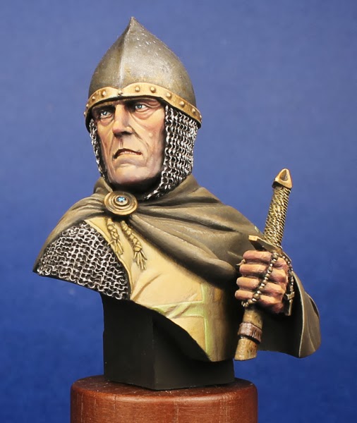
Para probar mi nuevo estudio de fotografía (es el mismo de antes pero ahora establecido fijo y al lado de la mesa de pintura) he preparado un paso a paso de los ojos del nuevo busto que voy a pintar, se trata de la referencia Kazhatdram de la nueva marca coreana Galapagos Miniatures. Un busto brutal modelado y pintado para el box art por Ju-Won Jung. Esta casa para mi y con solo dos referencias en el mercado se ha convertido en la Young Miniatures de la fantasía, tanto por la idea, calidad y presentación.
To try my new photography studio (it is the same as before but now i've done it to be stay and next to my painting table) i have prepared a step by step of the painting process of a new bust i'm going to paint, it is Kazhatdram from the new brand Galapagos Miniatures. A brutal bust modeled and painted for the box art by Ju-Won Jung. That brand for me, with only two references , has become the Young Miniatures of the fantasy, as for the idea, quality and aspect.
Os pongo la nomenclatura de las marcas de colores que he usado:
LF: Life Color
VMC: Vallejo Model Color
CC: Citadel Color (Todos son de la antigua gama, podéis encontrar una tabla de equivalencias aquí)
I give you the names of the paint brands i have used:
LF: Life Color
VMC: Vallejo Model Color
CC: Citadel Color (All are from the old brand, you could find an equivalenci chart here)
Después del consabido y tradicional preparado, limado y limpieza de la figura monto la figura, pego las máximas piezas con la previsión de lo que me puede molestar y lo que no, así dejo a parte la bandera y asta, el mango que asoma de la espada y la decoración del casco. Imprimo el busto en Negro Mate LF
After the well known of preparing, sanding and cleaning process I began to mount the figure, i attach as many pieces as i could, looking after of what can disturb and what not, then i let a part the whole standard, the sword row and the helmet decoration. I print the bust with Flat Black LF

Lo primero que hago es dar una capa
base y bien cubriente de Marrón Cubierta de VMC, normalmente en
bustos usaría algo mas claro o incluso blanco en este paso, pero al
ser un orco quiero una esclerótica “sucia”.
The first i do is to give a base coat which covers properly using Deck Brown VMC. Normally in bust i use to use a lighter colour maybe white, but it is an orc, and i want a “dirty” sclerotic.

Acto seguido realizo una sombra con negro y Marrón Chocolate VMC a partes iguales, esta la aplicare en tres zonas del globo con distintas opacidades. Para ello diluyo el color y por superposición de mas o menos voy oscureciendo o dejando la base mas a la “vista”. La primera zona que es común en los dos ojos es la parte superior del globo donde será muy oscura. La segunda, también común, es en la zona inferior donde será menos intensa que la anterior. Y por último la tercera que es una sombra en el lado izquierdo del globo (en el caso del ojo izquierdo la sombra queda en el “rabillo” del ojo y el el lado derecho en la zona del lagrimal). Todo esto lo hacemos con cuidado de respetar y reservar una pequeña zona de color base, en el caso del ojo izquierdo iría en la zona del lagrimal y en el derecho en la zona del “rabillo” del ojo.
After that i do a shadow with black and Chocolate Brown VMC 1/1, the mix will be applied in three zones changing the dark. To do that i watter the colour and with the supperposition of different layers y achieve a darker o lighter finish letting the base colour more “untouched”. The first zone which is common on the two eyes is the top part of the eye ball, that will be the most dark. The second, common on the two eyes too, will be the inferior part of the eye globe, it will be less darker than the previous. The third and last is a subtle shadow in the left part of the ball (in the left eye it is wich is in the end of the eye, in the right one it is nxt to its lacrimal). All of that is done with the care to let a little zone untouched of the base colour, that zones will be exactly the contrary of the last shadow explained.

Ahora vamos con la zona interior del
parpado inferior y lagrimal. Creo una mezcla de: Rojo Violeta VMC,
Arena Marrón VMC y Rojo LC en una proporción aproximada de 2/1/1.
le doy una capa base a la zona mirando de dejar las partes mas
profundas en negro, diluyo un poco la pintura y fundo las zonas que
he dejado en negro para que se cree una transición mas suavizada,
aprovecho esta mezcla diluida y la aplico sobre el globo ocular en la
zona que toca con el lagrimal.Now i paint the inside of the down eyelid and lacrimal. I do a mix of: Violet Red VMC, Brown Sand VMC and Red LC in a more or les 2/1/1 proportion. I give a coat leting the crevices in black, i watter a little the paint and blend a little that black zones getting a smother finish. Using that diluited paint i do a subtle tone next to both lacrimals.

Ahora establezco lo que serán los iris para ello y a diferencia de lo normal hago dos redondas con Scab Red CC le hago una mirada coherente y amenazadora pero sin buscar la perfección de una mirada humana ya que este es un “bicho feo”.
Now i draw what will be the irises, for that and in a diffferent way ai do in a normal bust, i do to circles of Scab Red CC i give him a coherent and threatening look, but avoiding the perfection of a human look, because, it is an “ugly beast”.

Como el color es relativamente claro me permite establecer desde ya el la pupila esta sera alargado como la de los reptiles. En negro.
As the color is a bit light i cold draw from now where the pupils are. Them will be elongated as de reptils. In Black.

Ahora empiezo a aclarar el iris para ello cojo directamente Golden Yellow CC y perfilo la pupila e ilumino el ojo por la parte inferior, pero, lo hago mediante rayitas y puntos para que le de un efecto como los “dibujos” de los ojos.
Begin to light the irises, for that i take Golden Yellow CC direct and i otline the pupil first then i higleght the iris in their inferior part, but, i do it doint little lines and dots to achive the offect of the “draws” of the eyes.

Ahora creo una mezcla a partes iguales
de los dos colores usados (Scab Red y Golden Yellow). Lo aplico de
nuevo a modo de diminutas rayas y puntos entre los dos colores, así
fundo un poco la transición, de nuevo no busco una transición
perfecta, sino que dé un efecto natural.
Then i do a mix of the two colors used (Scab Red and Golden Yellow). I apply that mix between the other two colours tos smoth the transition but again dong lines and dots to not achieve a perfect gradation, i'm searching a natural finish.

Echo esto empiezo a subir el amarillo
con Blanco LF digamos que con una proporción de 2/1, siguiendo la
iluminación usada hasta ahora.
Done that i began to light the yellow with White LF more or less in a 2/1 range, reinforcing the higlighting progress doing until now

Ahora añado un poco mas de blanco a la mezcla para dar las últimas luces al iris. También realizo una sombra en la parte superior la cual se ha perdido un poco al pintar la redonda con Scab Red. Para ello añado un poco (muy muy poco) de Snot Green CC a la mezcla usada como sombra del globo ocular.
Now it's time to add a little more white to the previous mix to do the last lights to the irises. I do a little shadow in the upper partof the irises, thats why i´ve los a little when i painted the initial red dot. For that i add a little (so so little) amount of Snot Green CC to the mix used to shadow the gloves previously.

Rehago la pupila afinando y
definiendola al máximo. Para finalizar los ojos realizo el reflejo
con un puntito de blanco puro en la parte superior del iris
descentrado un poco para darle mas viveza a la mirada. También
ilumino el interior del parpado inferior ya que es muy grueso y me da
pie a darle una pequeña luz, para ello mezclo el color usado como
color base con un poco de Marrón Cubierta. Por última recorto con
negro esta zona porque me había quedado excesivamente ancha y se me
iba a la zona exterior del parpado.
I redo the pupils doins a fine as i could. To end the eyes i do the reflection with a little dot of pure white in the upper part of the irises, a little bit descentrated to give more live to the look. I highlight the inner part of the eyelid because they are big. To do that i mix a little of Deck Brown with the mix used before to paint that part. To end the wole zone i delimitate it with black because some part were excessive width and mount on the exterior of the eyelid.

Espero que os haya gustado el mini pap
y os sea útil. Quizá haga algún proceso mas dentro de esta figura,
ya lo veremos... :) ¡Saludos!
Hope you like that mini sbs and it will be usuful sometime for you. Maybe I will do another progres on that figure, we will se... :) Regards!